Elementor makes building beautiful websites incredibly easy. But one common frustration many WordPress users face is layouts breaking on mobile devices.
You might design the perfect page on desktop, but when you check it on a phone, suddenly:
- Text overlaps
- Images look stretched
- Columns stack incorrectly
- Sections become too wide
- Buttons go outside the screen
If this sounds familiar, don’t worry — Elementor mobile layout issues are very common and easy to fix once you know where to look.
In this guide, we’ll walk you through the most effective ways to fix Elementor layouts on mobile, step by step.
Why Elementor Layouts Break on Mobile
Before fixing the problem, it helps to understand why it happens.
Most Elementor layouts break due to:
- Fixed widths instead of responsive widths
- Large padding or margins
- Incorrect column stacking
- Font sizes not optimized for mobile
- Images without responsive settings
- Too many nested sections
Desktop screens are wide, but phones are narrow. If your layout isn’t flexible, things start breaking.
How to Fix Elementor Layout Breaking on Mobile
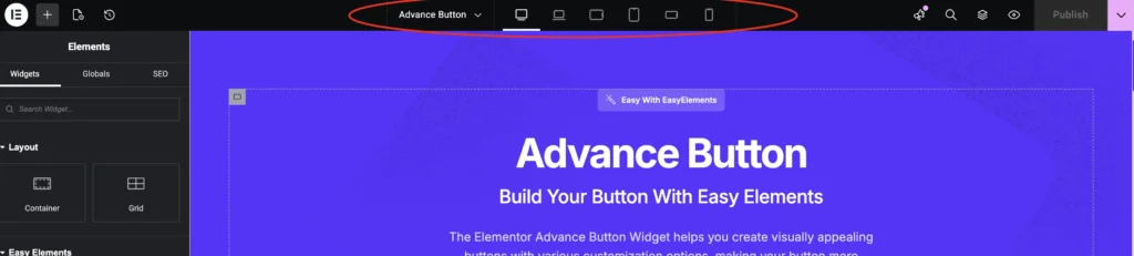
1. Check Elementor Responsive Mode
The first thing you should do is open Responsive Mode in Elementor.
Steps:
1 – Open the Page with Elementor
2 – Click the Responsive Mode Icon at top of the screen
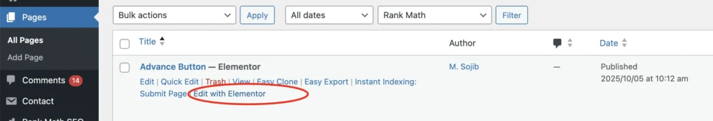
Open the page with Elementor
Switch between:
- Desktop
- Tablet
- Mobile
Now you can see exactly where the layout breaks.
Once you identify the problem section, fixing becomes much easier.
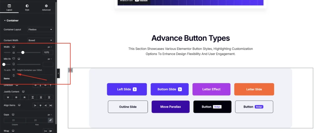
2. Fix Column Widths
Many layout problems come from incorrect column widths.
For example:
- A 4-column desktop layout may look great on desktop
- But on mobile it becomes too crowded
Solution
Select the container → Layout → Adjust width for mobile.
You can also use:
Column stacking
Example:
Desktop – 4 columns
Mobile – 1 column per row
This ensures everything stays readable.
3. Adjust Padding and Margins
Large padding often causes content overflow on mobile.
Example:
Desktop padding
80px left + 80px right
On mobile this creates very little space for content.
Fix
Go to the section → Advanced → Responsive
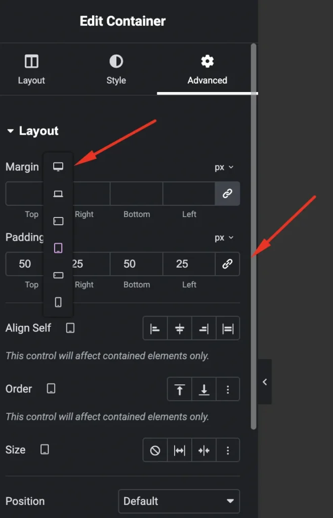
Reduce padding for mobile:
Desktop: 80px
Mobile: 20px
This instantly fixes many layout issues.
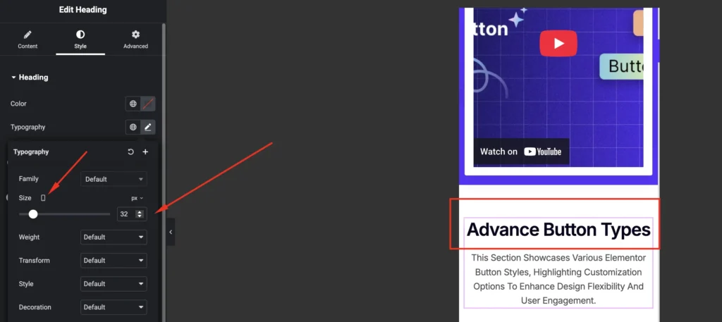
4. Use Mobile-Friendly Font Sizes
Large desktop typography often breaks mobile layouts.
Example:
Desktop Heading
72px
On mobile this will look huge.
Recommended sizes
Heading:
24px – 36px
Paragraph:
14px – 18px
Elementor allows separate typography settings for mobile, so always optimize fonts for smaller screens.
5. Hide Elements That Don’t Work on Mobile
Sometimes certain elements simply don’t belong on mobile layouts.
For example:
- Large background images
- Complex grids
- Decorative elements
You can hide them easily.
Steps:
Element → Advanced → Responsive
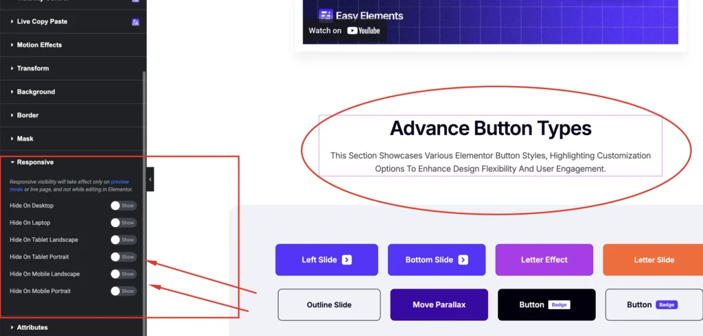
Then enable:
Hide on Mobile
This keeps your mobile layout clean.
6. Avoid Too Many Nested Sections
Another common mistake is too many inner sections.
Example:
Section
→ Inner Section
→ Inner Section
→ Column
→ Widget
This makes layouts difficult to control on mobile.
Instead:
Keep layouts simple and clean.
7. Use Flexible Containers (Recommended)
If you are using the new Elementor Flexbox Containers, your layouts will naturally become more responsive.
Benefits:
- Better stacking
- Cleaner structure
- Faster page loading
- Easier mobile control
Flexbox layouts behave much better on mobile devices compared to old section/column structures.
8. Use Responsive Widgets and Layout Tools
Sometimes layout problems happen because widgets are not optimized for responsive design.
This is where using a well-built Elementor addon helps.
For example, Easy Elements includes responsive widgets and layout tools designed specifically to work smoothly across desktop, tablet, and mobile.
With Easy Elements you get:
- Responsive Elementor widgets
- Pre-built mobile-friendly templates
- Layout blocks optimized for mobile screens
- Flexible container support
- Lightweight performance
Instead of building everything from scratch, you can simply import a ready-made responsive template and customize it.
This significantly reduces mobile layout issues.
9. Test on Real Devices
Elementor preview is helpful, but always test on real phones.
Recommended checks:
- iPhone
- Android device
- Tablet
Also test using:
Chrome DevTools → Device Simulation
Sometimes issues appear only on actual devices.
10. Clear Cache After Fixing
If changes don’t appear on mobile, it might be a cache issue.
Clear:
- WordPress cache plugin
- Browser cache
- CDN cache (if using Cloudflare)
Then refresh your page again.
Final Thoughts
Mobile traffic now accounts for over 60% of website visitors, so responsive design is no longer optional.
If your Elementor layout breaks on mobile:
- Check responsive mode
- Adjust padding and margins
- Fix column stacking
- Optimize typography
- Simplify layout structure
And if you want to save time, using responsive-ready tools like Easy Elements can help you build layouts that work perfectly across all devices.
A well-optimized mobile layout not only improves user experience but also boosts SEO rankings and conversions.