

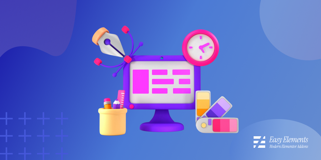
Elementor has revolutionized WordPress website design by allowing professionals and beginners alike to create stunning websites without touching complex code. However, most designers only use a fraction of Elementor’s capabilities. By mastering a few advanced techniques and hidden features, you can dramatically improve your workflow, create more engaging designs, and deliver faster-loading websites.
In this blog post, you’ll discover the most powerful Elementor tricks every website designer should know, from responsive design hacks and reusable templates to performance optimization and advanced customization techniques.
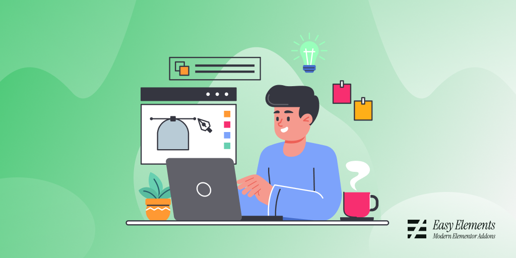
Why Elementor Skills Matter in Modern Web Design
Elementor skills matter in modern web design because they sit right at the intersection of speed, visual control, and no-code development—three things that define how websites are built today.
i. Faster website creation
With tools like Elementor, designers don’t need to write every line of HTML, CSS, or JavaScript from scratch. Instead, they can visually build pages using drag-and-drop components. This drastically reduces development time, especially for landing pages, business sites, and prototypes.
ii. Strong demand in the job market
Many businesses today use WordPress as their core CMS. Elementor is one of its most popular page builders, so knowing it gives you a practical advantage in freelance work, agency roles, and small business web projects where fast turnaround matters more than custom engineering.
iii. Design control without heavy coding
Elementor allows fine control over layout, spacing, responsiveness, animations, and styling. Designers who understand it can translate UI/UX ideas into real, responsive pages without relying heavily on developers for every change.
iv. Better client communication and flexibility
Clients often request frequent edits. With Elementor, changes like updating text, images, or entire sections can be done quickly without rebuilding code, making iteration smoother and cheaper.
v. Foundation for modern web workflows
Even though it’s a no-code tool, Elementor still teaches important web concepts: responsive design, visual hierarchy, spacing systems, and component-based design thinking. These skills transfer well to advanced tools and frameworks later.
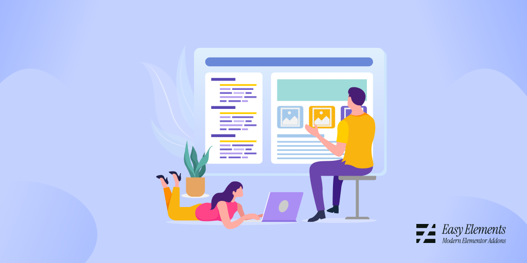
15 Elementor Tricks Every Designer Should Know
Here are 15 practical Elementor tricks that can noticeably improve your workflow, speed, and design quality when working with Elementor inside WordPress.
1. Use Navigator for complex pages
Navigator helps you view your entire page structure in a clean tree format, showing sections, columns, and widgets in one place. Instead of clicking through layers on the canvas, you can directly jump to any element.
This is especially useful when your page becomes large or heavily nested. It reduces confusion, speeds up editing, and prevents mistakes like editing the wrong section.
2. Global Colors & Fonts
Global settings let you define your main brand colors and typography once and apply them everywhere. This creates consistency across your entire website.
When a client requests a branding change, you don’t need to manually edit each page. One update in global settings refreshes the entire site instantly.
3. Save sections as templates
You can save frequently used designs like hero sections, testimonials, or pricing tables as reusable templates. This avoids rebuilding the same layout repeatedly.
It also helps maintain consistency across pages. Instead of redesigning from scratch, you simply insert a saved block and customize the content.
4. Right-click shortcuts
Right-clicking in Elementor reveals fast actions like duplicate, copy, paste, and save. This is much faster than using the sidebar controls every time.
Over time, these shortcuts significantly speed up workflow. Small time savings per action add up when building full websites.
5. Use Flexbox Containers
Flexbox Containers replace the older section-column structure and give you more control over layout alignment and spacing. They are more modern and efficient.
They also improve responsiveness and reduce unnecessary code. This leads to cleaner design structure and better performance.
6. Responsive editing per device
Elementor allows you to customize layouts separately for desktop, tablet, and mobile. This ensures your design looks good on all screen sizes.
You can adjust font sizes, spacing, and even hide elements on specific devices. This level of control is essential for modern mobile-first design.
7. Custom CSS inside widgets
You can add custom CSS directly to specific widgets for advanced styling. This helps when default controls are not enough.
It allows precision without affecting the rest of the page. Designers can fine-tune hover effects, animations, or spacing easily.
8. Copy–Paste styles
Elementor lets you copy styling from one widget and apply it to another instantly. This includes fonts, colors, spacing, and effects.
This keeps design consistent and saves time when building multiple similar sections. It’s especially useful in large websites.
9. Display Conditions (Pro)
Display Conditions allow you to control when and where content appears. You can show different headers, footers, or sections based on rules.
For example, you can show different content to logged-in users or specific pages. This makes websites more dynamic and personalized.
10. Quick Finder (Ctrl/Cmd + E)
The Finder tool lets you instantly search for pages, templates, or settings. Instead of navigating dashboards, you jump directly to what you need.
This dramatically improves workflow speed, especially for large websites. It reduces time wasted clicking through menus.
11. Consistent spacing system
Using a consistent spacing scale (like 8px, 16px, 24px) keeps designs visually balanced. Random spacing often makes layouts look unprofessional.
A structured system improves readability and creates harmony across sections. It also makes future edits easier and more predictable.
12. Motion Effects control
Elementor includes animations like fade-ins, scrolling effects, and hover transitions. These can make websites feel modern and interactive.
However, they should be used sparingly. Too many effects can slow performance and distract users from content.
13. Stretch Section wisely
Stretch sections allow full-width layouts that span the entire screen. This is useful for modern, immersive designs like hero banners.
But combining them with inner containers keeps content readable. Without structure, stretched layouts can feel too wide and messy.
14. Theme Builder power
Theme Builder lets you design global parts like headers, footers, blog posts, and archives. This removes the need to design each page individually.
It ensures consistency across the entire website. Once set, every page automatically follows the same structure.
15. Performance optimization settings
Elementor includes settings to reduce unnecessary scripts and disable unused widgets. These small tweaks improve loading speed.
Faster websites improve SEO and user experience. Clean optimization also reduces bounce rates and improves conversions.
Elementor Workflow Hacks (Productivity Boosters)
Here are Elementor Workflow Hacks (Productivity Boosters) designed to help you build faster, stay organized, and reduce repetitive work while using Elementor inside WordPress.
Start with a reusable wireframe system
Instead of designing every page from scratch, create a base wireframe (hero, content blocks, CTA, footer structure). This becomes your “starter kit” for all new projects.
This approach keeps layouts consistent and removes early decision fatigue. You focus on content and refinement instead of rebuilding structure every time.
Build a personal template library
Save your most-used sections like testimonials, pricing tables, FAQs, and contact forms. Over time, you build a drag-and-drop design system.
This dramatically speeds up production for client sites. You simply insert, tweak, and publish instead of redesigning common sections repeatedly.
Use global styles like a design system
Set global colors, fonts, and spacing rules before building pages. This ensures every new element automatically follows your brand system.
It also prevents inconsistency across pages. When changes are needed, updating one global setting updates the entire site instantly.
Work in Navigator-first mode
Open the Navigator panel early and keep it active when working on complex layouts. It gives you a full structural overview of your page.
This reduces misclicks and speeds up editing in deeply nested designs. You spend less time searching and more time refining.
Duplicate instead of recreating
When you like a section layout, duplicate it and modify instead of rebuilding from scratch. Even if changes are needed, it’s faster than starting over.
This hack becomes powerful in large projects with repeated patterns. It also ensures design consistency across pages.
Master keyboard shortcuts (especially Finder)
Using shortcuts like Ctrl/Cmd + E (Finder) lets you jump to pages, templates, or settings instantly. It eliminates dashboard navigation delays.
Over time, shortcuts compound into major time savings. You reduce “click fatigue” and stay in a creative flow state longer.
Design mobile adjustments early
Instead of fixing mobile views at the end, switch between desktop/tablet/mobile while designing. This prevents layout breakdowns later.
It reduces rework significantly. Mobile-first thinking ensures smoother responsiveness from the beginning.
Use copy-paste style workflows
Copy styles from one widget and apply them to others instead of manually adjusting each one. This ensures visual consistency.
It’s especially useful for typography, buttons, and spacing systems. You can design once and replicate everywhere.
Limit plugin and widget overload
Only use necessary widgets and avoid adding too many third-party add-ons. Heavy setups slow down both design and performance.
A lean setup keeps Elementor responsive and easier to manage. It also reduces conflicts and maintenance issues.
Create “section presets” for speed builds
Turn frequently used layouts into presets that can be dropped into any page instantly. Think of them as modular building blocks.
This makes new page creation almost assembly-line fast. You focus only on content changes, not structure decisions.
Conclusion
Elementor is much more than a simple drag-and-drop page builder. By mastering these Elementor tricks, website designers can create faster, more responsive, and more visually impressive websites while significantly reducing development time.
Whether you’re building client websites, business pages, eCommerce stores, or personal portfolios, these advanced Elementor techniques will help you get more value from the platform and stay ahead of the competition.
Frequently Asked Questions (FAQs)
What are the best Elementor tricks for beginners?
The best Elementor tricks for beginners include using Global Widgets, responsive editing, reusable templates, Theme Builder, and Global Colors to create consistent and professional website designs faster.
Does Elementor affect SEO?
Elementor itself does not harm SEO. Proper use of heading tags, image optimization, responsive design, and performance optimization can help Elementor websites rank well in search engines.
How can I make Elementor websites load faster?
Use Containers instead of old sections, optimize images, enable caching, reduce plugin usage, and avoid excessive animations to improve website speed.
Is Elementor Pro worth it for professional designers?
Yes. Elementor Pro includes Theme Builder, Popup Builder, Dynamic Content, Custom CSS, Forms, and advanced design tools that significantly improve workflow and flexibility.
What is the most useful Elementor feature?
Many professional designers consider Theme Builder and Global Widgets the most useful features because they save time and ensure consistency across an entire website.
Can Elementor replace coding?
Elementor can replace much of the front-end coding required for website design. However, knowledge of HTML, CSS, and JavaScript remains valuable for advanced customization.
How do I create a fully responsive Elementor website?
Use Elementor’s responsive controls to customize layouts, typography, spacing, and visibility separately for desktop, tablet, and mobile devices.
Are Elementor templates good for SEO?
Yes. Well-optimized Elementor templates with proper heading structure, fast loading speeds, and mobile responsiveness can perform well in search results.