
Popups are interface elements that appear over a webpage to grab a user’s attention. They are commonly used to display offers, collect user input through forms, or share important updates. These popups can be activated by different user interactions, such as button clicks, scrolling behavior, or time delays. They are typically controlled using plugins or custom-built code.
Create the popup
Popups are created through WP Admin.
Go to WP Admin, navigate to Easy Elements -> Popup Builder
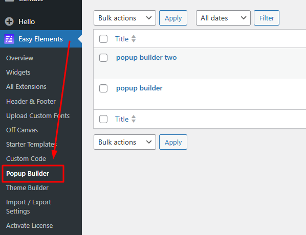
Navigate to Popup Settings -> Add new popup
Popup Builder – Display Settings
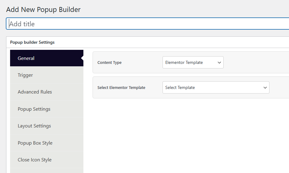
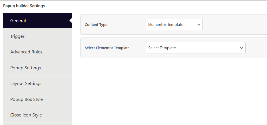
General tab settings
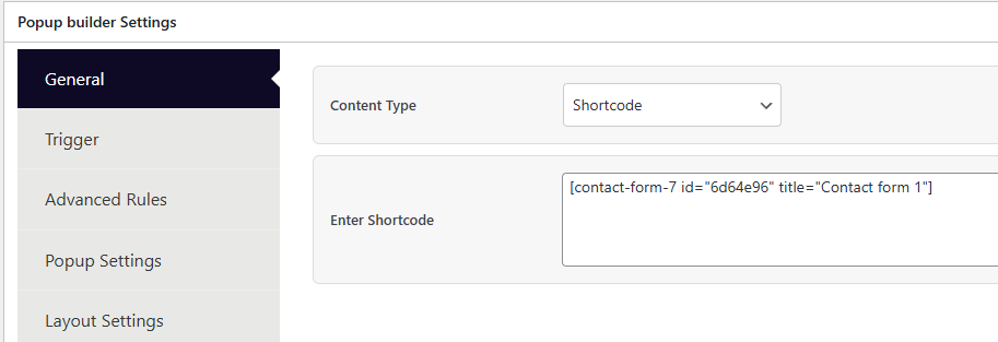
The General tab is the first tab in the Popup Builder settings. It controls what content the popup will display.
Content Type — Choose between two options:
- Elementor Template (default) — Select a pre-built
easy_popup_templatefrom a dropdown list. - Shortcode — Paste any shortcode (e.g., Contact Form 7, WPForms, etc.) into a textarea field.
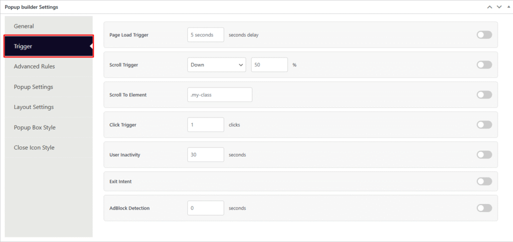
Popup Trigger settings
The Trigger tab controls when and how the popup appears on the frontend. Each trigger has an enable/disable toggle switch and configurable parameters. Multiple triggers can be enabled at the same time.
| # | Trigger | Options | Behavior |
|---|---|---|---|
| 1 | Page Load Trigger | Delay in seconds (e.g. 5) | The popup opens automatically after the specified number of seconds once the page has fully loaded. If set to 5, the popup appears 5 seconds after page load. |
| 2 | Scroll Trigger | Direction (Down / Up) + Percentage (e.g. 50%) | The popup opens when the user scrolls a certain percentage of the page in the specified direction. For example, scrolling down 50% of the page triggers the popup. |
| 3 | Scroll To Element | CSS Selector (e.g. .my-class) | The popup opens when a specific element becomes visible in the viewport as the user scrolls. You provide a CSS selector like .my-class or #my-id. |
| 4 | Click Trigger | Number of clicks (e.g. 1) | The popup opens after the user clicks anywhere on the page a specified number of times. Setting it to 3 means the popup appears on the 3rd click. |
| 5 | User Inactivity | Duration in seconds (e.g. 30) | The popup opens when the user has been idle (no mouse movement, scrolling, or keyboard input) for the specified duration. Useful for re-engaging inactive visitors. |
| 6 | Exit Intent | Toggle only (no extra options) | The popup opens when the user’s mouse cursor moves toward the browser’s top edge, indicating they are about to leave the page (close tab or navigate away). Desktop only. |
| 7 | AdBlock Detection | Delay in seconds (e.g. 0) | The popup opens when an ad blocker is detected in the user’s browser. The delay sets how many seconds to wait after detection before showing the popup. |
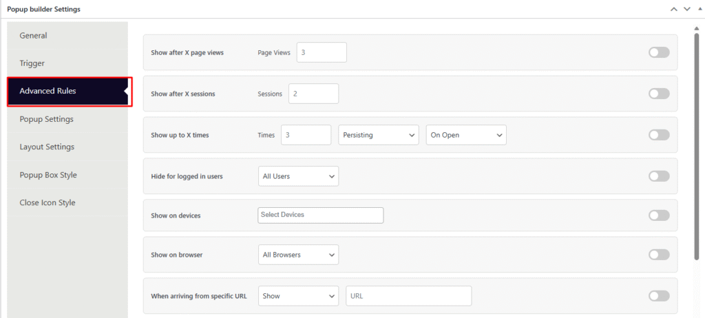
Advanced Rules Tab
The Advanced Rules tab controls who sees the popup, when, and under what conditions. These are conditional visibility rules that let you fine-tune popup targeting beyond basic triggers. Each rule has an enable/disable toggle switch.
| # | Rule | Options | Behavior |
|---|---|---|---|
| 1 | Show after X page views | Number (e.g. 3) | The popup only appears after the visitor has viewed at least the specified number of pages on the site. Useful for engaging returning or exploring visitors rather than first-time arrivals. |
| 2 | Show after X sessions | Number (e.g. 2) | The popup only appears after the visitor has started at least the specified number of sessions. A session is a new visit to the site. Targets repeat visitors. |
| 3 | Show up to X times | Number + Period (Persisting / Session / Day / Week / Month) + Count on (On Open / On Close) | Limits how many times the popup can be shown to a single visitor within the selected time period. “On Open” counts each time the popup opens; “On Close” counts only when the visitor actually closes it. Prevents popup fatigue. |
| 4 | Hide for logged in users | All Users / Custom (multi-select roles) | Hides the popup from logged-in users. Set to “All Users” to hide from everyone who is logged in, or “Custom” to pick specific WordPress roles (e.g. Administrator, Editor, Subscriber). |
| 5 | Show on devices | Multi-select: Desktop, Mobile Portrait, Tablet Portrait, Tablet Landscape, Laptop | Restricts popup display to selected device types only. If no devices are selected, the popup shows on all devices. |
| 6 | Show on browser | All Browsers / Custom (multi-select: Chrome, Firefox, Safari, Edge, Internet Explorer) | Restricts popup display to specific browsers. Set to “All Browsers” for universal display, or “Custom” to pick specific browsers. |
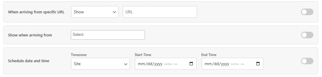
| 7 | When arriving from specific URL | Action (Show / Hide / Regex) + URL input | Controls popup visibility based on the referrer URL. Show — only display the popup if the visitor came from the specified URL. Hide — hide the popup if they came from that URL. Regex — match referrer URLs using a regular expression pattern. |
| 8 | Show when arriving from | Multi-select: Search Engines, External Links, Internal Links, Direct Entry, Social Networks | Controls popup visibility based on traffic source. Only shows the popup when the visitor arrives from the selected source types. |
| 9 | Schedule date and time | Timezone (Site / Visitor) + Start Time + End Time (datetime pickers) | Restricts popup to a specific date/time window. Choose whether the schedule follows the site’s timezone or the visitor’s local timezone. The popup will only appear between the start and end times. |
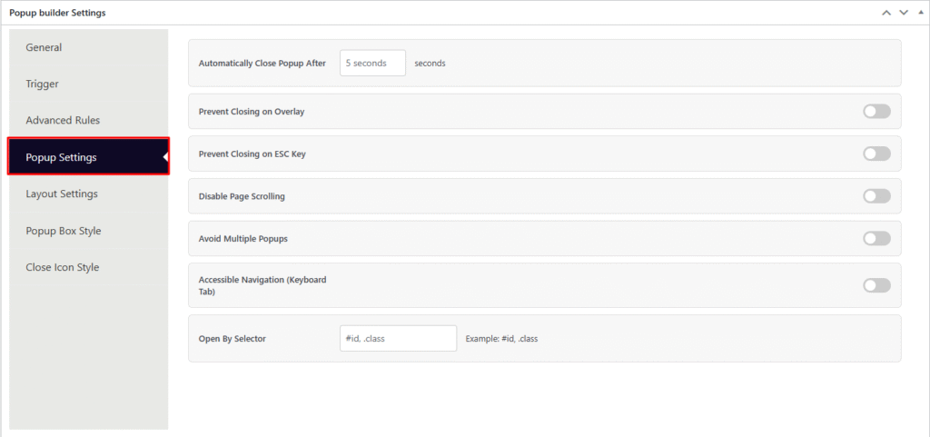
Popup Settings Tab
The Popup Settings tab controls the popup’s closing behavior, scrolling, accessibility, and manual open triggers. These settings define how the popup interacts with the user once it is displayed.
| # | Setting | Type | Behavior |
|---|---|---|---|
| 1 | Automatically Close Popup After | Number (seconds) | The popup will automatically close itself after the specified number of seconds. For example, setting 5 means the popup disappears on its own after 5 seconds without any user interaction. Leave empty to keep the popup open until the user manually closes it. |
| 2 | Prevent Closing on Overlay | Toggle (on/off) | When enabled, clicking on the dark overlay background behind the popup will not close it. The user must use the close button to dismiss the popup. Useful for important notices or mandatory forms. |
| 3 | Prevent Closing on ESC Key | Toggle (on/off) | When enabled, pressing the Escape key on the keyboard will not close the popup. Forces the user to interact with the close button instead. |
| 4 | Disable Page Scrolling | Toggle (on/off) | When enabled, the page behind the popup becomes unscrollable while the popup is open. The background stays fixed, keeping the user focused on the popup content. Scrolling resumes once the popup is closed. |
| 5 | Avoid Multiple Popups | Toggle (on/off) | When enabled, if another popup is already visible on the page, this popup will not open. Prevents multiple popups from stacking on top of each other and overwhelming the visitor. |
| 6 | Accessible Navigation (Keyboard Tab) | Toggle (on/off) | When enabled, users can navigate through the popup’s interactive elements (buttons, links, inputs) using the Tab key on the keyboard. Improves accessibility for users who rely on keyboard navigation instead of a mouse. |
| 7 | Open By Selector | CSS Selector (e.g. #id, .class) | Allows the popup to be opened by clicking on any element that matches the given CSS selector. For example, entering .open-popup means any element with that class will act as a popup trigger when clicked. Multiple selectors can be comma-separated (e.g. #btn, .cta-link). |
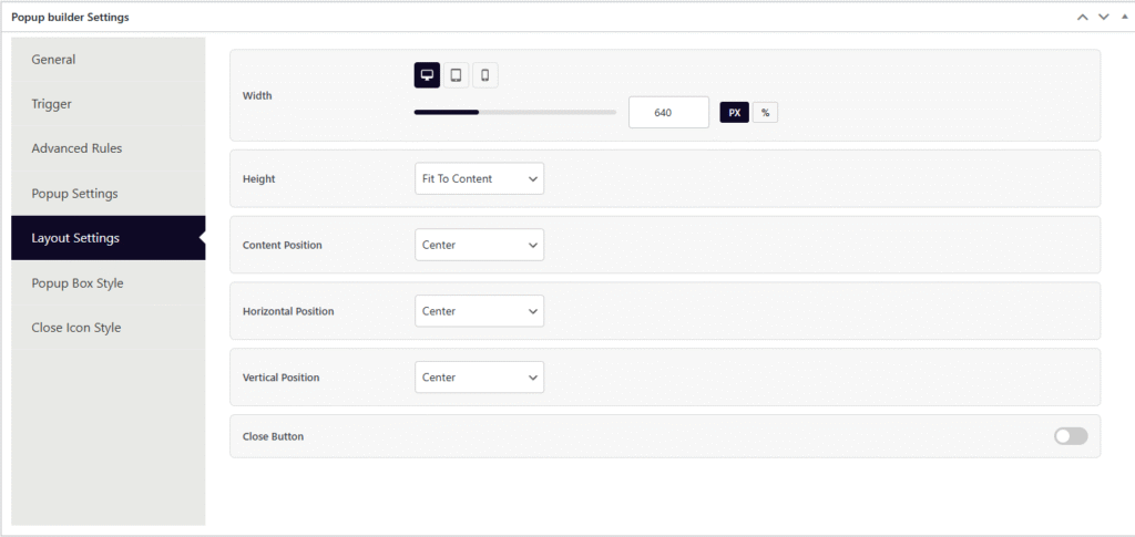
Layout Settings
The Layout Settings tab controls the popup’s dimensions, position on screen, and close button visibility. It includes responsive device controls for width.
| # | Setting | Type | Behavior |
|---|---|---|---|
| 1 | Width | Number + Unit (PX / %) with responsive device tabs (Desktop, Tablet, Mobile) | Sets the popup container width. Each device breakpoint (Desktop, Tablet, Mobile) can have its own width value and unit. A slider UI is provided for visual adjustment. Desktop default is 640px. Tablet and Mobile inherit the desktop value if left empty. Max range is 2000 for PX and 100 for %. |
| 2 | Height | Select: Fit To Content / Fit To Screen / Custom (px) | Controls the popup height. Fit To Content (default) — the popup height adjusts automatically based on the content inside. Fit To Screen — the popup stretches to fill the entire viewport height. Custom — set a fixed height in pixels (e.g. 400px). The custom px input only appears when “Custom” is selected. |
| 3 | Content Position | Select: Top / Center / Bottom | Aligns the content vertically inside the popup box. Default is Center. Useful when the popup height is larger than the content — this controls where the content sits within that space. |
| 4 | Horizontal Position | Select: Left / Center / Right | Controls where the popup appears horizontally on the screen. Default is Center. Set to Left or Right to push the popup to the side of the viewport (e.g. for slide-in style popups). |
| 5 | Vertical Position | Select: Top / Center / Bottom | Controls where the popup appears vertically on the screen. Default is Center. Set to Top for header banners or Bottom for sticky footer-style popups. |
| 6 | Close Button | Toggle (on/off) | Shows or hides the close (X) button on the popup. When disabled, the user cannot close the popup via the close icon — they must rely on overlay click, ESC key, or auto-close (unless those are also disabled in Popup Settings). |
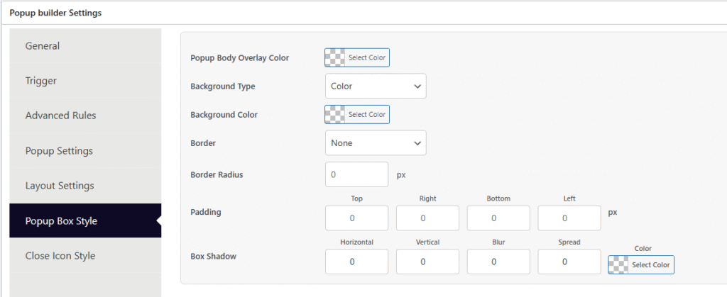
Popup Box Style
The Popup Box Style tab controls the visual appearance of the popup container — its overlay, background, border, spacing, and shadow.
| # | Setting | Type | Behavior |
|---|---|---|---|
| 1 | Popup Body Overlay Color | Color picker (with alpha/opacity support) | Sets the color of the dark background overlay that covers the entire page behind the popup. Supports RGBA for transparency. Default hint is rgba(0,0,0,0.5) (semi-transparent black). Set fully transparent to have no visible overlay. |
| 2 | Background Type | Select: Color / Image | Chooses whether the popup box background is a solid color or an image. Selecting one hides the other’s fields dynamically. |
| 3 | Background Color | Color picker (with alpha support) | Sets the popup box’s background color. Only visible when Background Type is Color. Default hint is #ffffff (white). Supports RGBA for transparent or semi-transparent backgrounds. |
| 4 | Background Image | Image uploader (WordPress media library) | Upload or select a background image for the popup box. Only visible when Background Type is Image. Includes a preview thumbnail, “Choose Image” button, and “Remove” button. |
| 5 | Background Size | Select: Cover / Contain / Auto | Controls how the background image fills the popup box. Cover — scales to fill entirely (may crop). Contain — fits inside without cropping. Auto — uses the image’s original size. Only visible when Background Type is Image. |
| 6 | Background Position | Select: Center Center / Center Top / Center Bottom / Left Center / Right Center | Controls the focal point of the background image within the popup box. Only visible when Background Type is Image. |
| 7 | Background Repeat | Select: No Repeat / Repeat / Repeat X / Repeat Y | Controls whether the background image tiles. No Repeat — single instance. Repeat — tiles in both directions. Repeat X/Y — tiles horizontally or vertically only. Only visible when Background Type is Image. |
| 8 | Border | Type select (None / Solid / Dashed / Dotted / Double / Groove) + Width (px) + Color picker | Adds a border around the popup box. Width and color fields only appear when a border type other than None is selected. Color supports alpha transparency. |
| 9 | Border Radius | Number (px) | Rounds the corners of the popup box. A value of 0 means sharp corners. Higher values create more rounded corners (e.g. 20 for a pill-like effect). |
| 10 | Padding | 4 number inputs: Top, Right, Bottom, Left (px) | Sets the inner spacing between the popup box edge and its content. Each side can be controlled independently. |
| 11 | Box Shadow | Horizontal (px) + Vertical (px) + Blur (px) + Spread (px) + Color picker | Adds a shadow effect around the popup box. Horizontal/Vertical — offset direction. Blur — softness of the shadow edge. Spread — size expansion of the shadow. Color — shadow color with alpha support. Default hint is rgba(0,0,0,0.5). |
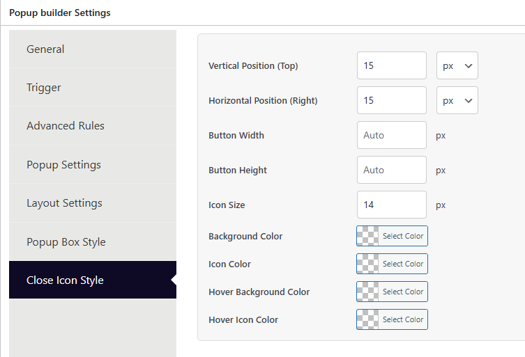
Popup Close Icon
The Close Icon Style tab controls the appearance and positioning of the popup’s close (X) button.
| # | Setting | Type | Behavior |
|---|---|---|---|
| 1 | Vertical Position (Top) | Number + Unit (px / %) | Sets how far the close button is placed from the top edge of the popup box. Default is 15px. When using %, max value is capped at 100. |
| 2 | Horizontal Position (Right) | Number + Unit (px / %) | Sets how far the close button is placed from the right edge of the popup box. Default is 15px. When using %, max value is capped at 100. |
| 3 | Button Width | Number (px) | Sets a fixed width for the close button container. Leave empty for Auto sizing (button sizes itself based on the icon). |
| 4 | Button Height | Number (px) | Sets a fixed height for the close button container. Leave empty for Auto sizing. |
| 5 | Icon Size | Number (px) | Controls the size of the close (X) icon itself inside the button. Default is 14px. |
| 6 | Background Color | Color picker (with alpha support) | Sets the background color of the close button in its normal (default) state. |
| 7 | Icon Color | Color picker (with alpha support) | Sets the color of the close (X) icon in its normal state. |
| 8 | Hover Background Color | Color picker (with alpha support) | Sets the background color of the close button when the user hovers over it. Provides visual feedback on interaction. |
| 9 | Hover Icon Color | Color picker (with alpha support) | Sets the color of the close (X) icon when the user hovers over it. |


