



Enhance the shopping experience with instant product previews without leaving the page. Customers can quickly view details and make faster purchase decisions. It saves time and adds a modern touch to your store.
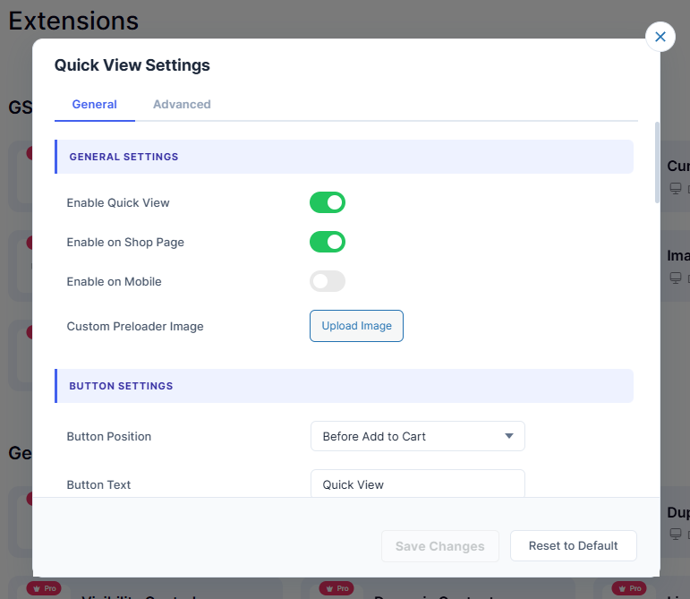
1. General Settings
- 1.1 – Enable Quick View: Toggles the Quick View feature on or off site wide.
- 1.2 – Enable on Shop Page: Shows or hides Quick View button on the Shop page.
- 1.3 – Enable on Mobile: Enables or disables Quick View on mobile devices.
- 1.4 – Custom Preloader Image: Upload a custom loading image for the popup.
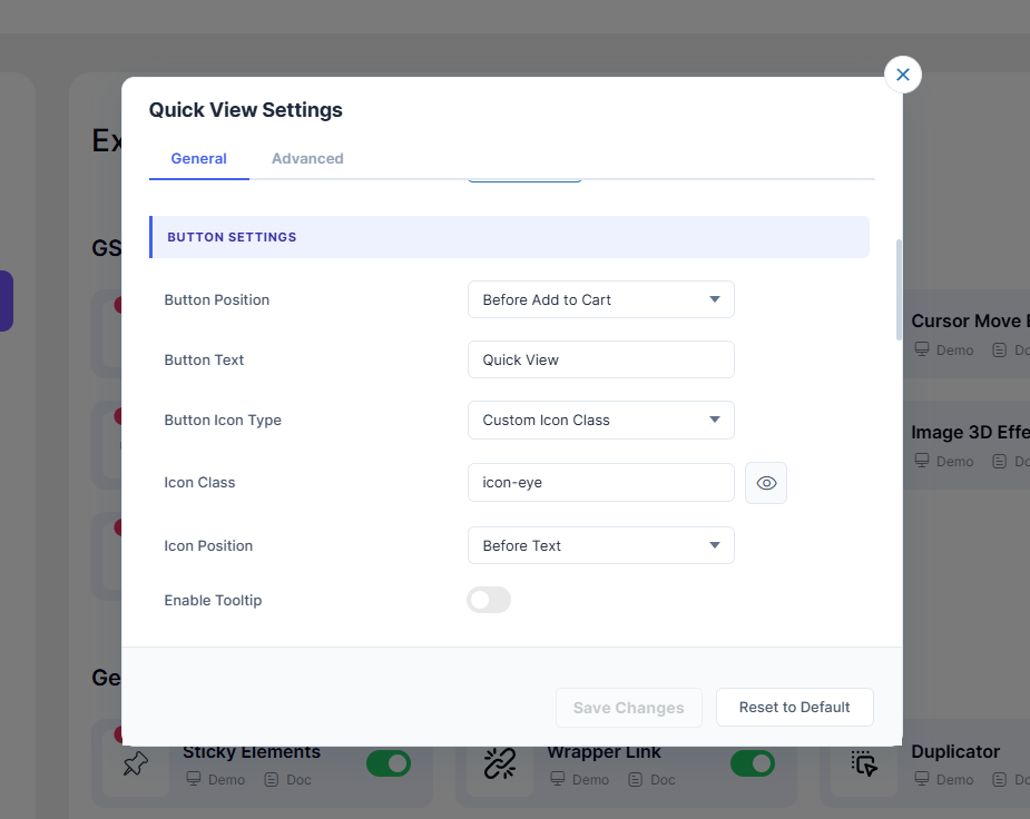
2. Button Settings
- 2.1 – Button Position: Set where the Quick View button appears on product cards.
- 2.2 – Button Text: Customize the label shown on the Quick View button.
- 2.3 – Button Icon Type: Choose between no icon, default, custom class, or image.
- 2.4 – Icon Class: Enter or pick a custom icon class for the button.
- 2.5 – Custom Icon Image: Upload your own image to use as the button icon.
- 2.6 – Icon Position: Place the icon before or after the button text.
- 2.7 – Enable Tooltip: Show a tooltip when hovering over the button.
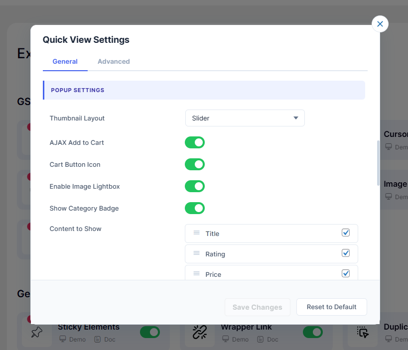
3. Popup Settings
- 3.1 – Thumbnail Layout: Display product images as a slider or single image.
- 3.2 – AJAX Add to Cart: Add to cart from popup without page reload.
- 3.3 – Cart Button Icon: Show or hide icon inside the Add to Cart button.
- 3.4 – Enable Image Lightbox: Open product images in fullscreen lightbox view.
- 3.5 – Show Category Badge: Display the product category as a badge in popup.
- 3.6 – Content to Show: Choose and reorder content items shown in popup.
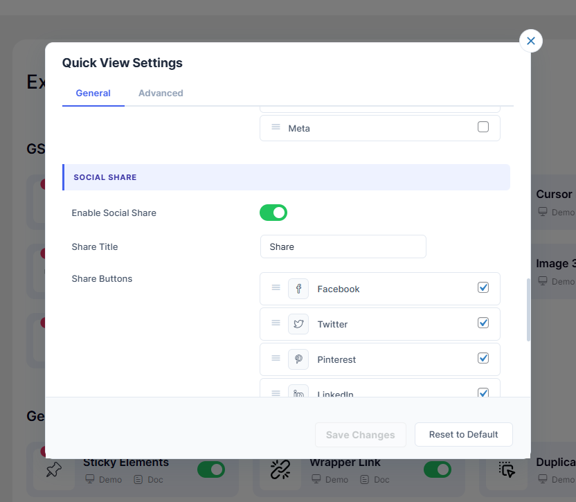
4. Social Share
- 4.1 – Enable Social Share: Show or hide social sharing buttons in popup.
- 4.2 – Share Title: Set the label displayed before the share buttons.
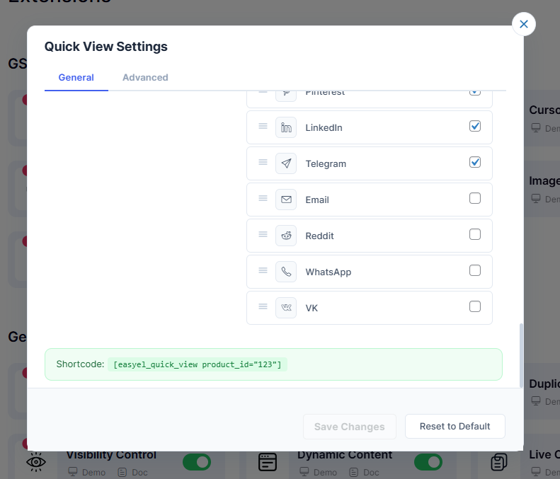
- 4.3 – Share Buttons: Enable, disable, and customize each social platform icon.
5. Shortcode
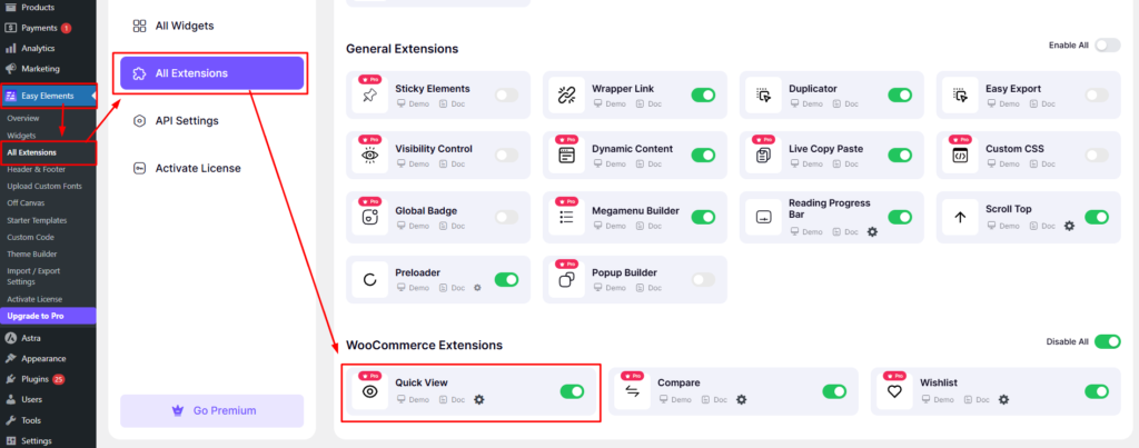
Go to Easy Elements → All Extensions → WooCommerce Extensions → Quick View
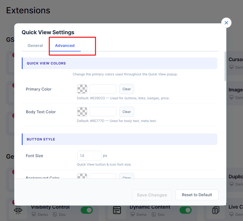
1. Quick View Colors
- 1.1 – Primary Color: Main accent color for buttons, links, badges and price. Default:
#629D23 - 1.2 – Body Text Color: Color used for body text and meta text. Default:
#6E777D
2. Button Style
- 2.1 – Font Size: Quick View button and icon font size in px. Default:
14px - 2.2 – Background Color: Background color of the Quick View button.
- 2.3 – Text Color: Label text color of the Quick View button.
- 2.4 – Icon Color: Color applied to the icon inside the Quick View button.
- 2.5 – Button Padding: Inner spacing of the button (Top, Right, Bottom, Left). Default:
6px 8px 6px 8px - 2.6 – Border Size: Border thickness around the button in px. Default:
1px - 2.7 – Border Color: Color of the border around the Quick View button.
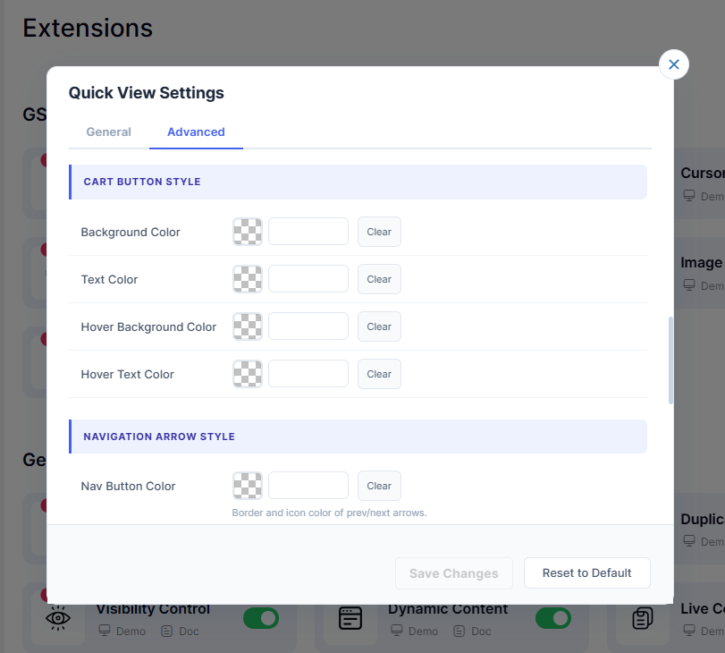
3. Cart Button Style
- 3.1 – Background Color: Background color of the Add to Cart button in popup.
- 3.2 – Text Color: Label text color of the Add to Cart button.
- 3.3 – Hover Background: ColorBackground color when hovering over the cart button.
- 3.4 – Hover Text Color: Text color when hovering over the cart button.
4. Navigation Arrow Style
- 4.1 – Nav Button: Color Border and icon color of the prev/next slider arrows.
- 4.2 – Nav Hover Background: Background color of navigation arrows on hover.
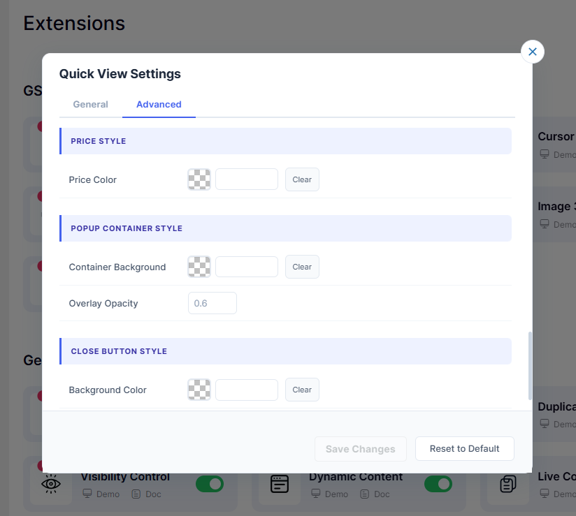
5. Price Style
- 5.1 – Price Color: Color of the product price displayed in the popup.
6. Popup Container Style
- 6.1 – Container Background: Background color of the Quick View popup container.
- 6.2 – Overlay Opacity: Darkness of the background overlay behind the popup. Default:
0.6
7. Close Button Style
- 7.1 – Background Color: Background color of the popup close button.
- 7.2 – Text Color: Icon: or text color of the popup close button.
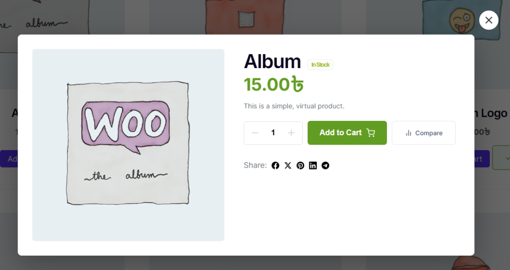
Front End of Quick view product
Clear view of the Quick view Popup box
Use this method to display Quick View with a specific product ID.

<?php echo do_shortcode('[easyel_quick_view product_id="123"]'); ?>

Use this inside WooCommerce loops to automatically get the product ID.

<?php
\EasyElements_Elementor\Pro\Extension\QuickView\Includes\QuickviewFrontend::render_quick_view_button_loop();
?>